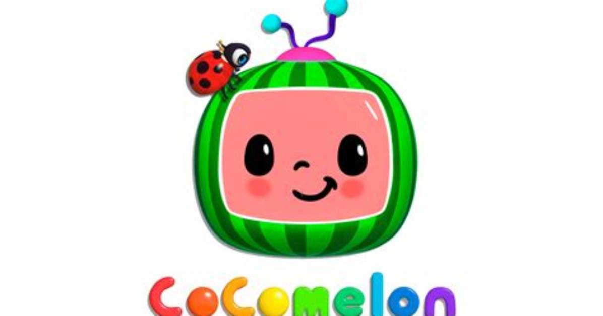
The Cocomelon logo has transformed over time through three significant redesigns, reflecting the channel’s growth and evolution. Each iteration of the logo has contributed to the brand’s identity and resonated with its young audience.
The first logo, used from 2006 to 2013, featured a charming alien child holding a TV frame with his face inside. This logo captured the channel’s playful and imaginative nature during its early years as ThatsMEonTV.
In 2013, the channel underwent a name change to ABCkidTV, accompanied by a logo redesign. The new logo showcased a child holding a red TV with a chalkboard screen, symbolizing the educational content provided by the channel. A ladybug was also introduced as a whimsical addition to the logo.
Finally, in 2018, the channel rebranded as Cocomelon, which brought about another logo update. The current logo incorporates a watermelon with a bright, friendly smile, evoking joy and happiness. This logo symbolizes the channel’s commitment to producing fun and engaging content for young viewers.
Let’s take a closer look at the evolution of the Cocomelon logo:
| Logo Redesign | Years Used |
|---|---|
| ThatsMEonTV Logo | 2006-2013 |
| ABCkidTV Logo | 2013-2018 |
| Cocomelon Logo | 2018-Present |

